



Why Packaging Color Accuracy Begins Before Printing
Most packaging color problems are decided before the press. Learn where color accuracy is won or lost, plus a 7-step framework to protect brand color.
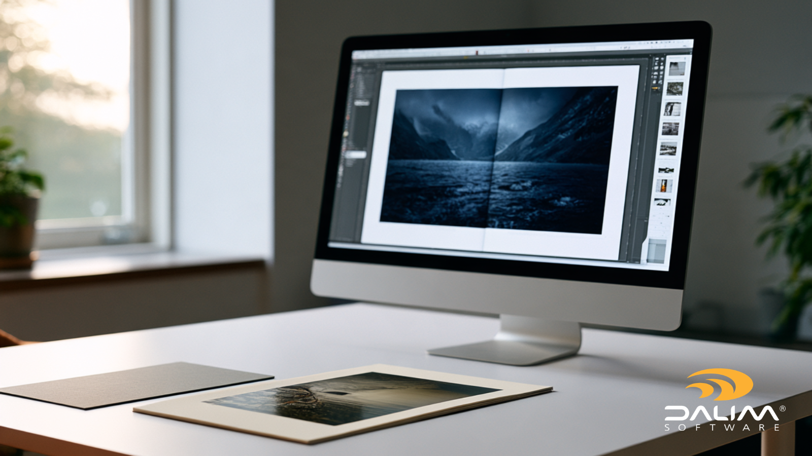
The photographer has signed off every image on screen. The designer has locked the layout. Then the first printed sheets arrive, and the deep blue in a painting reproduction has drifted toward purple, a portrait series looks slightly sunburned, and the shadow detail in a black-and-white spread has sunk into mud.
It's a familiar story in art and photography publishing, and it's rarely anyone's fault. Screens glow. Paper reflects. Unless you simulate that difference properly before press, you're approving a picture of the book, not the book itself.
That's why color-accurate soft proofing matters more than ever. Artists, estates, curators, designers and printers are often spread across several countries, and posting a hard proof to every one of them takes days. Our guide explains what soft proofing is, why art and photography books are harder to proof than most print work, and how to build a review process you can trust.
Color-accurate soft proofing is the process of previewing how a file will look on press by simulating the printing condition, including the paper, inks and press profile, on a calibrated display under controlled viewing conditions. It lets reviewers judge and approve color on screen before any ink is laid down.
The word "accurate" is doing real work in that definition. A PDF opened on a laptop in a café is not a soft proof. It's a preview, and it's fine for checking page order or a caption typo, but it can't settle an argument about whether a gray is neutral.
The international standard for these systems, ISO 14861, sets out requirements for equipment selection, setup and environmental conditions. It deliberately leaves out standalone displays in uncontrolled ambient light, because the room changes what you see. That single point explains most soft proofing disappointments.

A brochure can survive a small color shift. A monograph often can't. Here's what makes this category unforgiving:
Soft proofing works when five things line up. If any one is wrong, the others can't rescue it!
The proof is only as good as the ICC profile describing the final print condition. That profile should come from your printer and match the actual press, ink set and paper. A generic profile gives you a generic answer.
The monitor needs to be good enough, calibrated with a hardware measuring device, and recalibrated on a schedule. Displays drift. ISO 12646 is the related standard for displays used in proofing, and Fogra, the German research institute behind much of this work, certifies soft proof monitors and systems.
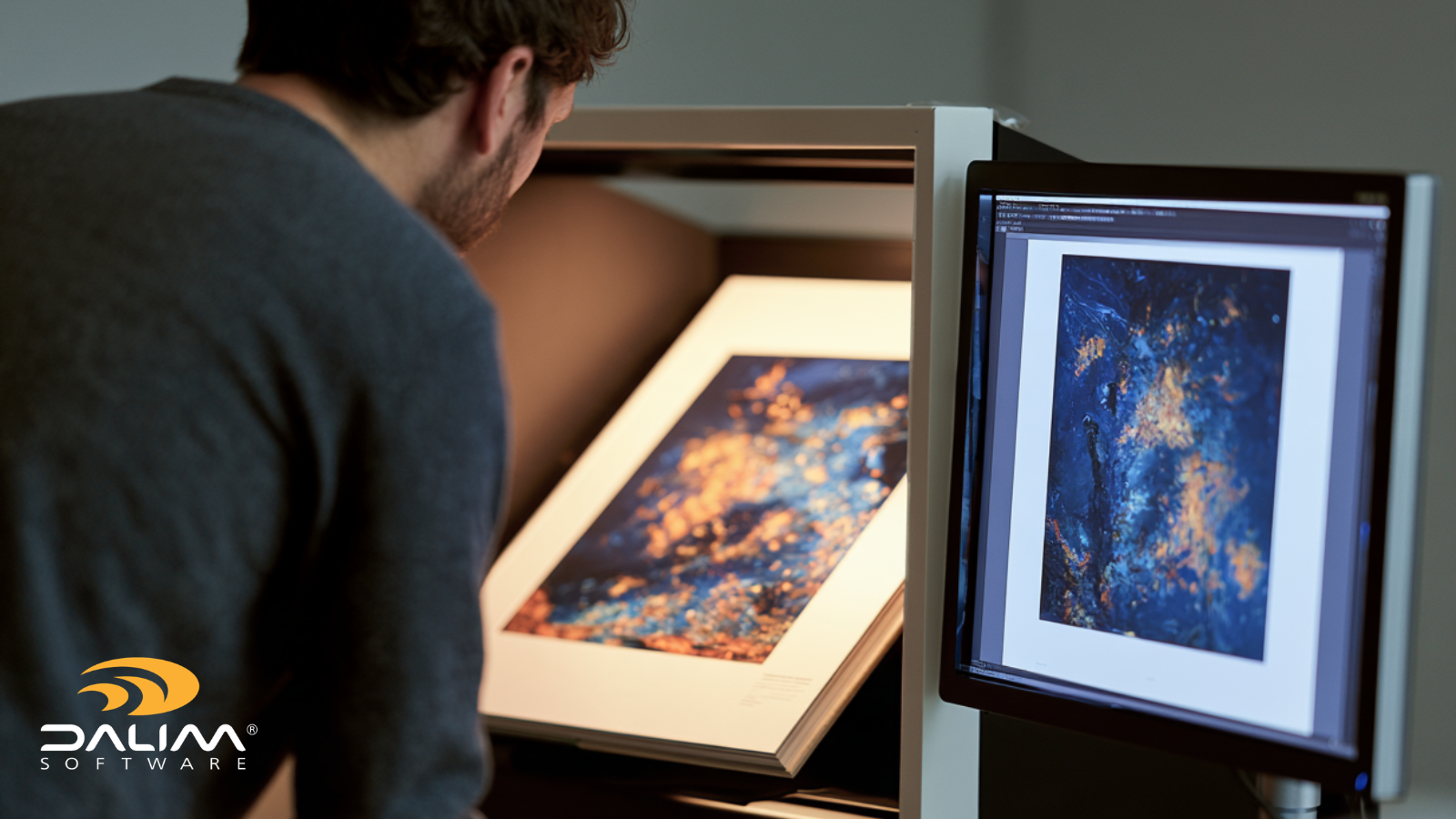
Subdued, neutral surroundings matter more than most teams expect. Sunlight on the screen, a bright window behind the reviewer or a colorful wall can all shift perception. For printed comparisons, a standardized viewing cabinet is the reference.
Images need a known profile attached or a clear conversion path. Soft proofing a file with the wrong source profile produces a confident, wrong answer.
Rendering intent and black point compensation change what you see. Relative colorimetric with black point compensation is a common starting point for proofing, while perceptual is often preferred for art reproduction. Compare at least two on your hardest images. Simulating paper white and ink black is useful for setting expectations, but don't make fine corrections based on a simulation alone.
Here's a workflow that works whether you're producing a 64-page artist's book or a 400-page museum catalogue.

Neither is better in every situation. They do different jobs.
|
Traditional hard proof |
Modern soft proof |
|
|---|---|---|
|
Speed |
Days, once printing and shipping are counted |
Minutes to hours |
|
Sharing |
One physical copy per reviewer |
Many reviewers, same file, same time |
|
Revision rounds |
Each change can mean a new print |
Each change is a new on-screen version |
|
Color reliability |
High, if made and viewed correctly |
High, if the display and room are controlled |
|
Audit trail |
Often scribbled notes and email |
Comments and approvals tied to versions |
|
Best for |
Final sign-off on critical images, contract reference |
Iteration, remote review and routine approval |
|
Common mistake |
Best practice |
|---|---|
|
Proofing with sRGB or a generic CMYK profile |
Use the printer's profile for the actual press and paper |
|
Judging color on an uncalibrated laptop |
Calibrate with a measuring device and recheck regularly |
|
Reviewing in a bright, mixed-light room |
Use a dim, neutral space or a viewing cabinet |
|
Sending screenshots by email |
Annotate on the proof itself, in one place |
|
Treating every reviewer the same |
Separate color-critical reviewers from content reviewers |
|
Skipping gamut warnings |
Check out-of-gamut colors before approval, not after printing |
That fifth row is worth pausing on. Not everyone needs a color-calibrated setup. A publisher's lawyer checking credits or an author proofing captions can review the content from anywhere. The people judging tone and color, such as the photographer, the retoucher, the art director and the printer, need controlled displays. Being explicit about who falls into which group stops a lot of confusion.
Color is only half the challenge. Picture a museum catalogue with a curator in one country, a designer in another, an artist's estate in a third and a printer in a fourth. (That's an illustrative scenario, not a customer story.) Each person has opinions, and each opinion arrives in a different format: a screenshot, a phone call, a marked-up PDF, a reply-all.
Three problems follow:
Good workflow technology addresses these directly. Browser-based review keeps everyone on the same version. Comments pinned to the image remove ambiguity. Automated routing and reminders keep rounds moving. An audit trail records who approved what.
This is the territory DALIM FUSION's Review & Approval module covers. It's a browser-based online proofing environment that simulates ICC and device color profiles, can sync with calibrated monitors and viewing booths, and includes tools such as a densitometer, gamut and ink coverage checks, and color validation reports. Reviewers can compare versions side by side, as an overlay or as a pixel-level difference, zoom in deeply on fine detail, and invite external reviewers through controlled links without giving them access to the wider system. Approvals follow a defined workflow, and every action is logged. File checks can also run before review, so basic problems with bleeds, resolution or fonts are caught before anyone spends time judging color. For a look at soft proofing inside a wider premedia workflow, see our Quad Graphics case study.
It's worth being realistic about what software can and can't do. It can make the simulation consistent and the process traceable. It can't fix an uncalibrated display or a bright room, which is why the earlier steps matter just as much.

Art and photography books often involve rights, lenders and approval clauses. Treat proofing as part of governance, not just production:
When a printed color is questioned, that archive turns an argument into a quick check.
Soft proofing doesn't replace good judgment, a good printer or, for the images that matter most, a trip to the press. What it does is move the hard conversations earlier, when changes are cheap, and give every reviewer the same view of the same version.
Get the print condition, the display and the room right, then build a review process that records what was decided. If you'd like to see how that could look for your own titles, the DALIM team is always happy to talk through the workflow with you. You can also read more about how DALIM supports publishing teams.
Soft proofing means previewing how a job will print by simulating the printing condition on a calibrated screen instead of producing a physical proof. It's used to check and approve color, and often layout and content, earlier in production.
It can be, when the press profile is correct, the display is calibrated, and the viewing environment is controlled. Most publishers still keep a hard proof or press check for the most color-critical images, and use soft proofing for everything leading up to that point.
You need the printer's ICC profile, a good display, a hardware calibration device, a controlled viewing space, correctly tagged image files and software that can simulate the output condition. A reference print or press sample is a valuable extra.
A hard proof is a physical print made to simulate the final result. A soft proof is the same simulation shown on a display. Hard proofs are tangible and widely trusted, while soft proofs are faster to share and easier to revise.
Use the profile your printer supplies for the exact press, ink set and paper stock. If the paper changes, the profile should change too. Generic profiles give approximate results at best.
Screens emit light, while paper reflects it. Screens set too bright, a paper white lower than the monitor's, and ink limits all make prints look darker and less saturated. A calibrated display and soft proof settings that simulate the paper show this before printing.
Yes, for content and general review. For color judgment, the remote reviewer also needs a calibrated display and a controlled viewing space. If they don't have one, ask them to approve content and leave the color decision to a reviewer who does.
Most packaging color problems are decided before the press. Learn where color accuracy is won or lost, plus a 7-step framework to protect brand color.
Learn what FDA labeling rules and GS1 barcode standards require in packaging artwork, plus a practical framework to build compliance into your...
Discover how to build a marketing approval process your team will actually follow - with practical steps, common pitfalls, and tools that make it...