

 Rebecca Freeman
Artwork Version Control Across Hundreds of SKUs
 Rebecca Freeman : Jul 28, 2026, 3:26:36 PM
How brands managing hundreds of SKUs can build version control that scales, prevents costly errors, and keeps every market working from one file.

You approve a carton. The black looks deep and confident on screen and on the proof. A few weeks later the Spanish run arrives with a flat, grayish panel. The German run has text that sits a little off its background. And someone in the US wants to know why the ingredient copy printed in the wrong language on a different edition.
The design wasn't the problem. The black was.
Black is the most-used color in packaging and print, and one of the least consistent. It can be built several different ways, and each one reacts differently to presses, substrates and standards. When one pack travels through several markets and printers, those differences stack up.
Our guide explains how 100% K, rich black, spot black and a fifth black each work, why they shift between markets, and a practical process for specifying black once so it prints the way you intended everywhere. It also covers where automated preflight and approval workflows can catch problems before press.
Rich black is black ink printed over other CMYK inks to make it deeper. Spot black is a premixed black ink printed on its own plate. A fifth black is an extra black plate printed on top of the four CMYK plates, often to carry market-specific text. Each behaves differently on press, so each needs its own rule.
This is black ink only, on one plate. It's the safest choice for small text and fine lines because there's nothing to misregister. The trade-off is that large solid areas can look slightly gray or washed out, especially on coated stock.
Rich black adds cyan, magenta and yellow under the black. Common builds include C60 M40 Y40 K100, which totals 240% ink. Other printers recommend lighter or heavier mixes, and one prepress workflow guide describes an offset packaging rich black as 100% K plus 40% cyan. There's no single universal recipe.
It gives large solid areas more depth. It also uses more ink, takes longer to dry, and puts several plates on the same edge. Slight misregistration can show as a colored halo around small type. It's also typically avoided in flexo.
A spot black is a premixed ink, printed from one plate and called out by name in the file, such as a Pantone black. Density and shade are controlled at the ink kitchen rather than built from dots, and there's only one plate to register. The catch is that it needs a press unit, and the match depends on the ink formulation and the substrate. If a digital press has to convert it to CMYK, the result depends on how that conversion is done.
A fifth black is a separate 100% black spot plate added to the four process plates. It started in publishing as a "text black" for co-editions. The CMYK artwork is printed once, then a language-specific black plate is swapped in for each country. Packaging teams face the same logic whenever artwork is shared and the copy changes by market, such as languages, claims or regulatory text.
|
Black type |
How it's made |
Best for |
Main risk |
|---|---|---|---|
|
100% K |
One black plate |
Small text, thin lines |
Looks flat in large solids |
|
Rich black |
K plus C, M and Y |
Large solid areas in offset and digital |
Halos from misregistration, higher ink load, cost |
|
Spot black |
Premixed ink, own plate |
Brand-critical black, solids and text in packaging |
Needs a press unit; shade shifts if converted to CMYK |
|
Fifth black |
Extra 100% black plate over CMYK |
Text that changes by market |
Overprint errors, naming errors, wrong plate |
The same file can print differently in two countries, and nobody has to make a mistake for that to happen. Here's why.
So there's no safe default. The right rich black recipe depends on the press, the ink and the paper, which is why printers will tell you to ask them for their numbers.
The fifth-black problem is what happens when a separate black plate has to agree with the CMYK black beneath it, across every market and printer that touches the job. When it goes wrong, it rarely goes wrong loudly. It shows up late, on press or on shelf.
Here are the six most common failure points.
Picture one carton going to three markets. The CMYK artwork is shared and each market gets its own black text plate. Market A prints offset with a fifth unit. Market B prints flexo with a premixed black. Market C runs digital with no spare station. That's three different conversions of the same black from one file. Without a written spec, each printer decides for themselves.
|
Common mistake |
Best practice |
|---|---|
|
One "black" swatch used for everything |
Give each black a defined role |
|
Small text in rich black |
Set small text in single-plate black |
|
Using the Registration swatch as black |
Use a real black, because Registration prints on every plate |
|
Reusing last job's rich black recipe |
Ask each printer for its recipe and ink limit |
|
Approving only the composite proof |
Check plates separately with overprint and separations preview |
|
Spot names that vary between files |
Reuse one exact name from a master swatch library |
|
Leaving spot-to-CMYK conversion to the press |
Agree the fallback conversion in advance |
A black spec only works if it's applied the same way every time. Manual checks catch what a person happens to look for, and that changes with the person and the deadline.
Automation is where the written spec gets enforced. DALIM FUSION automates file checking and transformation, including preflight, color management, normalization and trapping. Its preflight covers color and overprints among other checks, auto-corrects common faults, and routes true exceptions for review. That's the layer where rules like "text black is K only" or "the fifth black must overprint" can live, once your team has written them down.
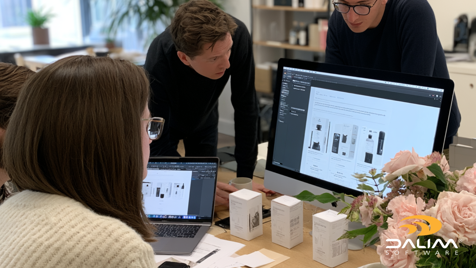
For packaging teams, the same platform validates artwork against dielines, color profiles, substrates and special inks, which need correct separations and trapping. It also supports localizing text late in the process and republishing artwork across markets with audit trails. If you're running multiple markets from shared artwork, that's the same shape of problem as the fifth black. Online proofing with layers gives reviewers a way to inspect printable and technical layers in context, and workflow automation keeps approvals moving between them.
Here at Dalim we also work with Fogra in Europe and IDEAlliance in the US, and our standards and partner activity is listed on our website. The checks are only as good as the spec behind them, so write the black rules first and then build them into the workflow.
If you'd like to see how your current preflight and approval steps handle black across markets, the team at Dalim is always happy to talk it through.
Rich black is built from black plus cyan, magenta and yellow, so it prints from several plates. Spot black is a single premixed ink on its own plate. Rich black adds depth to large solids in offset and digital. Spot black gives tighter control of shade and avoids registration issues between plates.
Not always. Rich black looks deeper in large solid areas, but it can cause halos on small type if plates shift slightly. 100% K is safer for text and thin lines. Most jobs use both, with each assigned to the role it handles best.
A fifth black is an extra 100% black plate printed alongside the four CMYK plates. Publishers use it as a text black so the same artwork can carry a different language in each country. It must be set to overprint, or white holes appear in the artwork behind it.
There isn't one. Common builds include C60 M40 Y40 K100 and recipes based on K plus about 40% cyan. The right mix depends on the press, ink, paper and the printer's total ink limit. Ask your printer which numbers they prefer before you build files.
Printers work to different standards, ink limits, processes and substrates. A rich black that looks deep on coated offset can look different in flexo, on uncoated stock or on a digital press that converts a spot black to CMYK. A written black spec for each printer reduces the surprises.
You can for very large type, but it's risky for small text. All the plates have to line up perfectly, so slight misregistration shows as colored edges and makes the type harder to read. Set small and medium text in 100% K.
Audit every black in the artwork, give each one a role, and collect each printer's print condition. Write one spec per market, set up the fifth black once with an exact name, and preflight against the spec. Then proof the plates, not just the composite.
 Rebecca Freeman : Jul 28, 2026, 3:26:36 PM
How brands managing hundreds of SKUs can build version control that scales, prevents costly errors, and keeps every market working from one file.
 Rebecca Freeman : Nov 3, 2026, 12:55:07 PM
Learn how to convert RGB to CMYK and spot colors to CMYK without surprises. Profiles, rendering intents, a 7-step process and common mistakes.
 Rebecca Freeman : Jul 2, 2026, 12:55:33 PM
Discover how artwork management software helps brand and packaging teams reduce errors, speed approvals, and stay compliant across every SKU and...